Color Theory
Light – the phenomenon of light which creates the visible spectrum helping us to distinguish one hue form from another. Light is waves. Each wave of different length caries different information creating different hues.
Visible spectrum consists of ROYGBIV: Red, Orange, Yellow, Green, Blue, Indigo and Violet. One way to memorize the order of the rainbow is to think of it as a name Roy G. Biv.
White light is the combination of all of the above.
Our perception of color is different from other animals.
What happens to light when it travels?
Light: reflect (mirror, glass), absorb (wood), transmit (diamond, glass), refract (straw in water), scattering (clouds, fluorescent lights).
How objects transmit color?
A red apple will absorb all waves except red, which is reflected.
White reflects all wavelengths.
Black absorbs all wavelengths. As a result it stores heat.
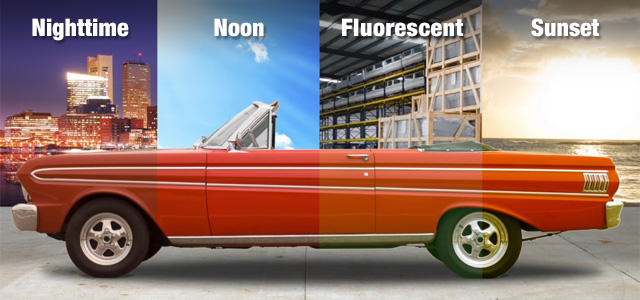
Color will change depending on the light sourse.
Color through history:
Aristotle developed the first known theory of color. According to him, God sent down color from heaven in form of celestial rays. His color theory evolved around four elements: earth (black), fire (white), wind (red) and water (yellow).
Even though scientists and artists alike tried to come up with different versions of color theory, Aristotle’s version remained influential for nearly 2000 years.
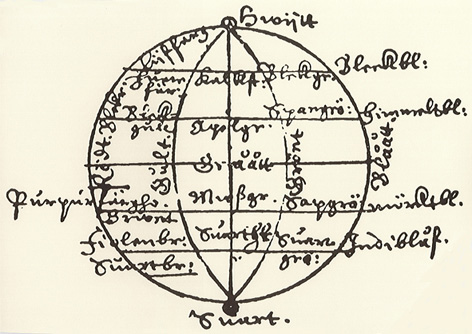
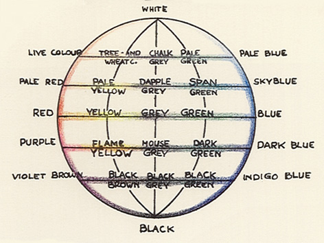
Aron Sigfrid Forsius, a Finish astronomer, invisioned the first color solid (seeing color in three dimensions: hue, saturatoin and value). The system originated in 1611 in a text by the author on physics. It consisted of (Black, white), red, yellow, green-blue.
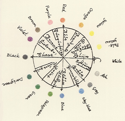
Robert Fludd, a physician, created the first color wheel around 1629-1631 based on Aristotle’s theory.
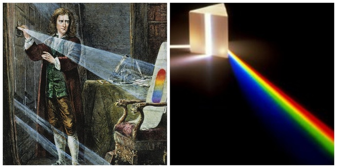
Sir Isaac Newton is credited with creating the first color wheel based on relationship of colors/hues. He conducted a series of experiments that he publishes in 1672 outlining his discovery.
Albert Henry Munsell an American artist, teacher and the creator of the Munsell Color System. The system is setup similar to the metric system. It is divisible by 5. First, Munsell setup the gray scale on the vertical with black at the bottom and white at the top. Next, he organized the chroma (intensity) moving away from the center. The further away from the center the more intense the color is. Finally, the hue is arranged at different angles producing away from the center, neutral colors.
Color mixing.
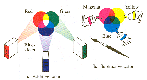
Additive: mixing color with light RGB (Red, Green and Blue).
Additive colors: combine light sources in order to create color. Adding Red and Green makes Yellow. The reason for this is that Yellow wavelength is present in both and when combined, Red and Green cancel each other out leaving only visible Yellow.
This is the way screens work, they illuminate color instead of reflecting it.
Subtractive: mixing pigments: mixing pigments to create a desired hue.
The reason why it’s called that is because when mixing pigments you are partially or completely subtracting (that is, absorbing) some wavelengths of light and not others.
Color theory creates a logical structure for:
Color Wheel, Color Harmony and Color Context.
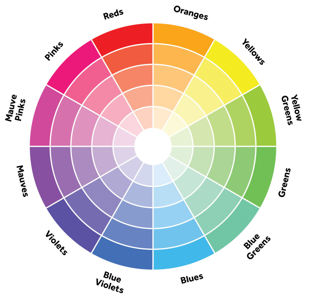
Color Wheel
Primary colors: yellow, red and blue.
Secondary colors: orange, violet and green.
Tertiary colors: yellow orange, red-orange, red-violet, blue-violet, blue-green, and yellow-green.
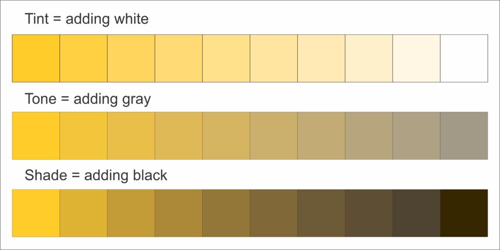
Tone, tint and shade
Color Harmony: a pleasing arrangement of parts. Harmony delivers visual interest and sense of unity and order.
Achieving Harmony:
Analogous are any three colors side by side on the color wheel.
Complimentary colors are colors that lie directly opposite each other. This will give you greatest contrast.
Split complementary: the split complementary takes the two colors directly on either side of the complementary color.
Triadic harmony: three equally distanced colors on the color wheel.
James Gurney
Color schemes based on nature
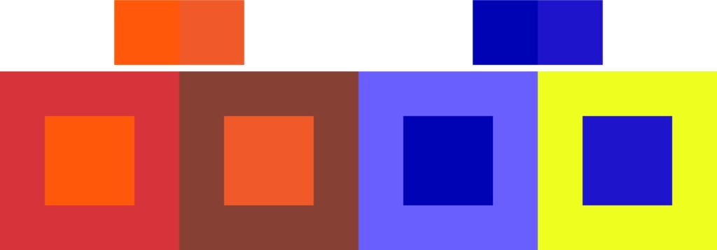
Color context: How color behaves in relation to other colors and shapes.
The relationship of values, saturations and the warmth or coolness of respective hues can cause noticeable differences in our perception of color.
Compare the contrast effects of different color backgrounds for the same red square.
Red appears more brilliant against a black background and somewhat duller against the white background. In contrast with orange, the red doesn’t stand out as much; in contrast with blue-green, it exhibits brilliance. Notice that the red square appears larger on black than on other background colors.


References


